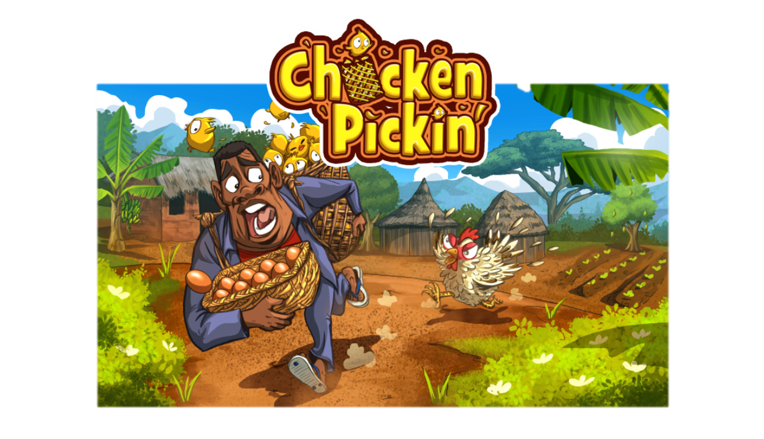
Get ready for an exclusive look behind the scenes of one of Maliyo Games’ most beloved titles, ‘Chicken Pickin’ Join us as we embark on a thrilling journey with a talented UI/UX designer, who will unveil the untold story of how she was a part of the transformation of this game into a sleek sensation in just two weeks. From the inner workings of her creative process to the secrets of the team’s favourable outcomes, you won’t want to miss this captivating tale of grit, determination and innovation!
In June 2022, Maliyo Games introduced the rapid prototyping model. With this model, a team of 2 developers have four weeks to develop a game prototype. ‘Chicken Pickin’ was part of the games created with this model. Once the stakeholders reviewed the prototype, it got the green light to move on to the next stage where we had to improve the game in two weeks.
The idea of the game is a fun one – collect eggs and chicks but avoid the mother hen. The goal for the two weeks was to update the game features, UI and art.
Prep Stage
At this stage, I wanted to prepare myself for the task ahead. Two weeks is pretty short. I started out by playing the current prototype – just to help me understand the game better. While playing, I made sure to take a screenshot of each game scene. Next, I took an audit of the current assets available (less UI). Then moved everything to Figma.
Ideation
As a team, we had ideation sessions where we came up with new features for the game. Keeping the time constraint in mind, we filtered out ideas that would take a long time to implement (remember timeline is just 2 weeks).
Mood board
While coming up with new ideas, I was tasked to create a mood board for the game UI. My vision for the UI was something soft, fun, and easy-going. I grouped my mood board into different sections: eggs, color, UI, African patterns, landing page ideas, level select, and UI components. One thing I had to constantly keep in mind was – “the game has to have an African feel.”
Pause
One thing I’d like to highlight is that throughout this process, I worked closely with the dev lead. I constantly asked questions and got feedback to ensure I’m on track.
Wireframes
I have play-tested the game, I have a mood board and we have come up with new features for the game. Do I start the wireframes now? Not quite. I still needed to understand what exactly I had to design. Next step, look through the dev team ideation session on Miro where they had outlined the core loop of the game. Once again, I took a screenshot and moved this to Figma.
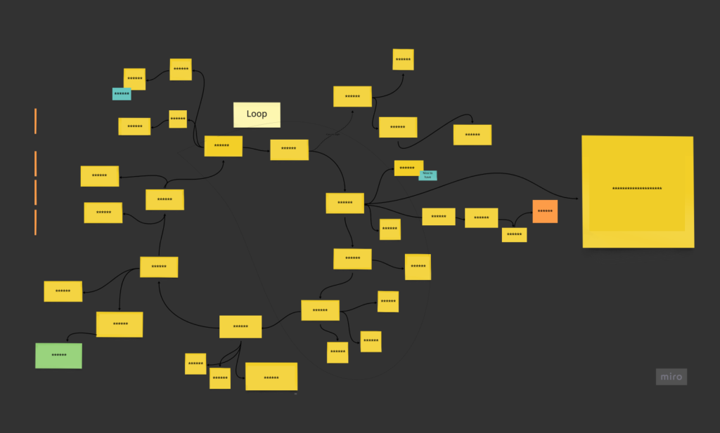
Looking through the game loop, I started making notes of the components and the pages I had to design. The way I did this was simple – read the sticky notes and asked myself questions. For example, let’s say the player runs out of time, what do I need to design for? I’d need a lose page, some buttons (home, restart), text (to pass across a message to the player), and so on. I also added sticky notes to serve as a reminder.
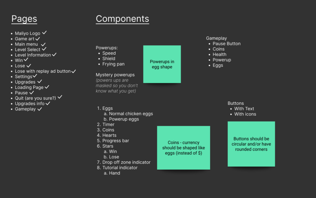
Given the tight deadline, I made sure to design the wireframes in medium fidelity – that is, they are quite detailed. The reason for this is speed. Details mean the UI designer can work faster and spend less time wondering what each component should look like.
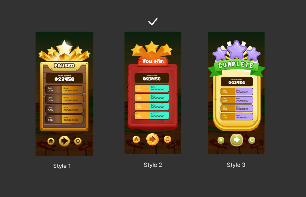
A major challenge I had was that I did not want us to have different button styles in the game. So if we have a single button style, how do I show emphasis in the game? The answer is SIZE. The button I want the user to “press” should be bigger than the other ones around.
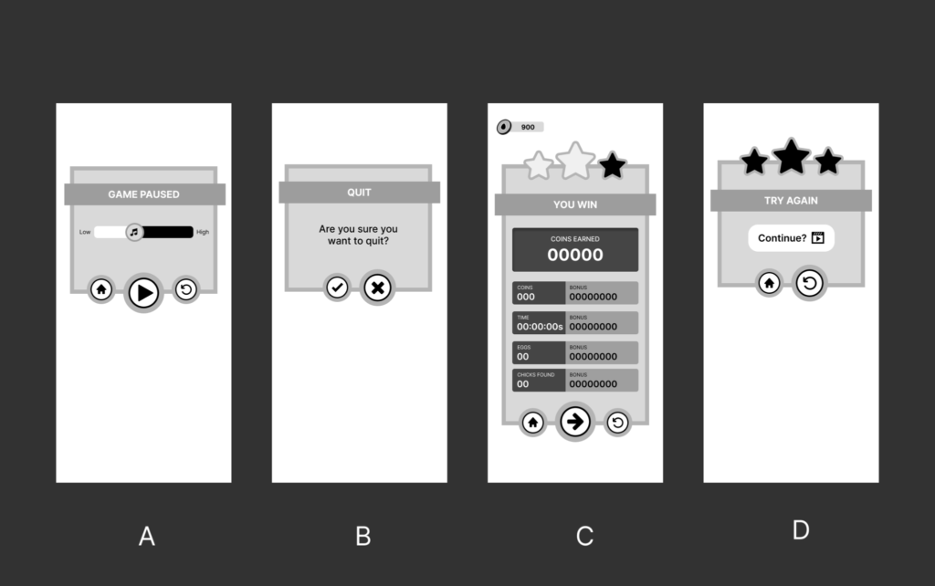
For image A, the game is paused. I want the player to resume playing hence you have a big play button. Image B, the player wants to quit playing but I don’t want them to. That’s why you have the big ‘x’ button. And in image D, the player has lost. I do not want them to return home, I’d like them to replay the level. My theory is simple, the bigger the button, the more the player wants to press it. They’ll see the size before the icon.
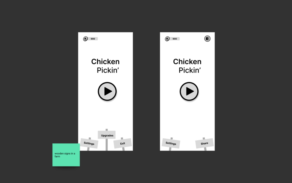
The wireframe had to go through different changes based on feedback from the lead game dev. For the home page (aka main menu), I thought since it’s a farm, it’ll be nice to have ‘wooden’ signs instead of buttons. Once I sent the wireframe for review, he suggested we move the ‘upgrade’ sign to the level select page. I did not want a cluttered home page so I opted for one large play button. If animated, the player would want to press it.
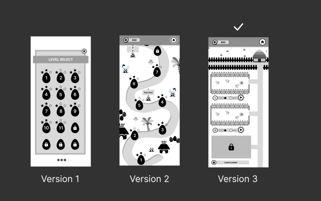
For the level select page, in version 1, the idea was to have eggs with numbers representing each level. I got feedback to improve on the design and I came up with (a rough) version 2 – which is supposed to represent a path on a farm. You had huts around with palm trees, chicks, eggs, and mother hen. Version 2 was cool but it did not work. The idea for version 3 came from the lead dev who thought it’ll be nice to have a mini farm where you can collect chicks and interact with them.
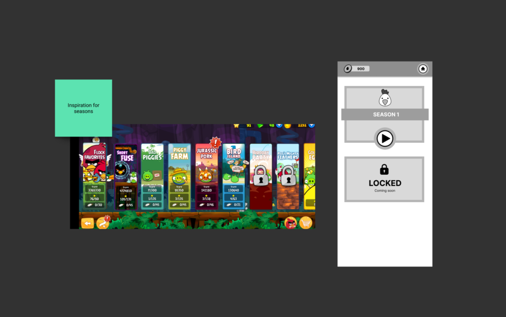
Initially, we did not have multiple seasons in the game. When I designed the third version of the level select, it occurred to me that having 30+ mini farms for each level would be too much. The design and the developer side of me had two opinions that I thought made sense.
From a design perspective, the player would have to scroll and scroll before they find the next level, leading to BAD UX (User Experience). And the developer side felt this could lead to performance issues. But we needed levels. The best solution I could come up with was to shorten the levels and create seasons. Each season will have its own theme, difficulty, chickens, eggs and level design.
The inspiration came from the Angry Birds game. I shared this idea with the dev lead and he approved.
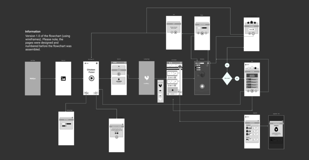
With wireframes approved, the next step is to create the user flows. While working on the Whot King game, I created different iterations of the user journey flow. In the final iteration, I decided to combine a flowchart and wireframe so we had a visual idea of how everything works. I used the same technique for this game. The flow is important because it helps the developers to know what happens when a player interacts with different elements in the game. If the player loses, what screen pops up? Also, we get to see how the player moves through the game. This is the perfect opportunity to spot areas that need to be improved.
UI Implementation
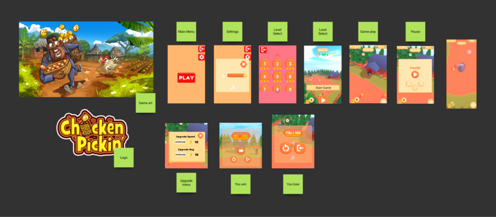
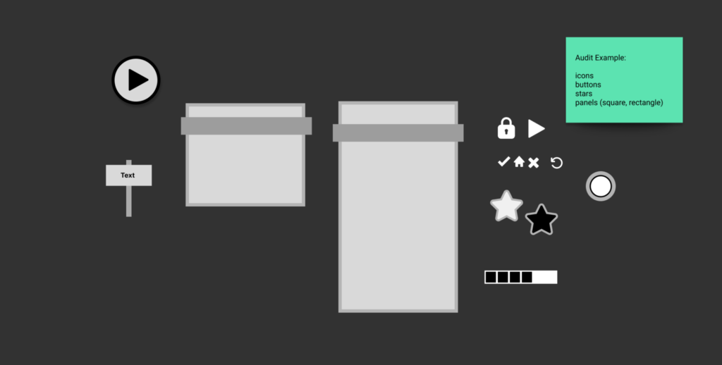
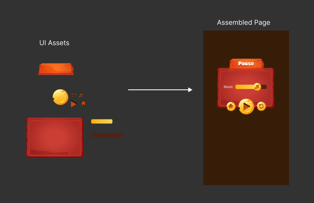
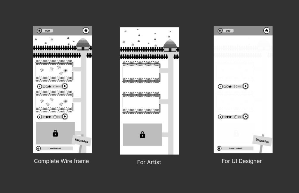
With limited resources and a tight deadline, I had to figure out the best way to handle UI implementation. The UI artist had other tasks on her plate meaning she wouldn’t be able to finish implementing the design before the deadline. I took an audit of the wireframes I had designed and made notes of the pages that had all the UI elements. The idea behind this is to have the UI artist design these pages, then send me the individual assets (buttons, panels, icons) and I will assemble the remaining pages like lego pieces. The image below is an example of the wireframe audit.
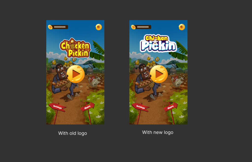
Looking at my landing page mood board ideas, I realised we may need a new logo for two reasons:
- The old logo blends with the game art (they’re the same style).
- During the ideation, the game concept was changed from picking chicks to eggs but the old logo depicted chicks in baskets.
To have different variations, I tasked the UI artist to come up with 3 samples of each of the page I sent. This means we would have 9 design styles (for each page) to pick from.
UI Implementation – a snag
As I started working on the pages, I realised some icons were small and if imported to Unity, they’d look blurry on the player’s device. The UI artist is in a different time zone (it was midnight at her end) and I couldn’t afford to wait till the next morning; the devs needed the UI assets urgently. I decided to recreate the icons myself in Figma.
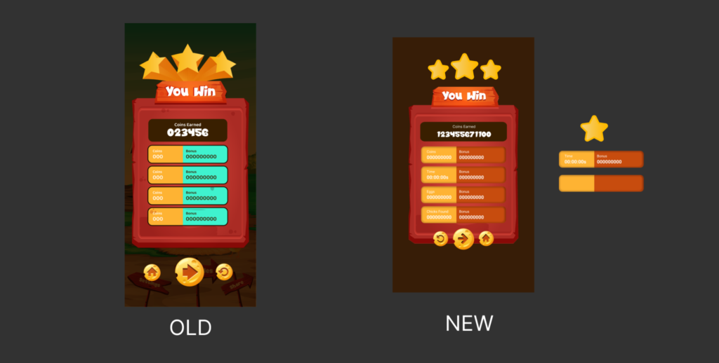
Another challenge was the winning stars. After attending the standup meeting with the devs that morning, I got to see their task list and I knew the stars will add more work for them. I decided to redesign that part ,too. I also changed the inner panels (colours and added shadows).
Art Implementation
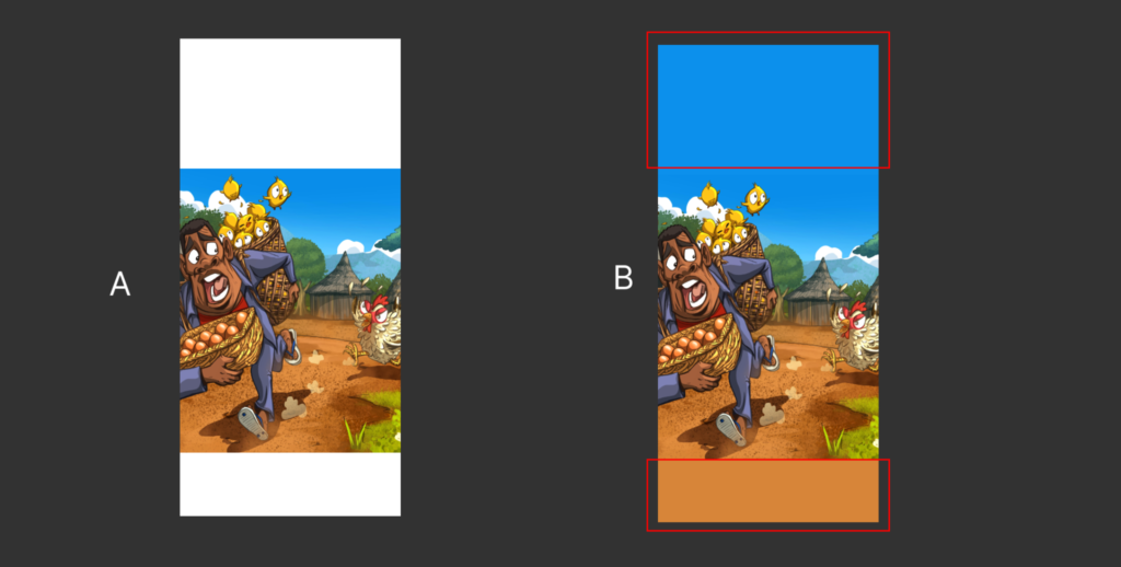
While prepping for the project, I realised the current game art might be an issue as it’s in landscape mode and our game is in portrait. If I resized the art in a portrait frame, we would have lots of white space (image A). I sent image B to the artist. I added more ground space at the bottom so we could have our signs and more blue (sky) at the top so we’d have space for the logo, exit and coin count.
A challenge I had was: How do I send the level design concept to the artist? I did not want him to design the icons, stars and buttons. Plus, I did not want the UI designer to create the level art. To solve this, I sent them different versions of the level design (see image)
Dev Handoff
Once all the pages were complete, I prepared to hand off to the developers. They had a file containing links to each page’s assets.
Challenges and Lessons
Improving a game prototype is no easy feat. We had to go through several iterations within tight time constraints and I had to battle the perfectionist in me. We did not have time to tweak things so I had to learn to let go.
One mistake I made was I did not format the art assets when I received them. While building the pages in Figma I noticed they had lots of empty spaces. I just wanted to get the UI assets to the devs as fast as I could and, in the process, I forgot to remove the extra spacing around the assets. I really like things to be perfect and it got to me that I made such a mistake. Lesson learned.
Conclusion
Chicken Pickin’ was the last game I worked on at Maliyo Games. I did not stay to get feedback on my work from the stakeholders. When they released Chicken Pickin’ to the public, it made me happy to see our hard work did not go to waste and people will play and give the company feedback. One thing I did was to download the game and see the new changes. It gave me some form of feedback and I got to see what had changed.