Friday afternoons at Maliyo Games are special and are filled with fun, learning, and bonding. It’s when the team at Maliyo Games comes together for an hour-long bonding session and we teach each other something new. It’s a crucial aspect of Maliyo Games’ culture of growth and development. In one of these sessions, one of our in-house developers shared his insights on User Interface/User Experience (UI/UX) best practices with the team. Here’s what we learned:
Game design is an important element of the entire production process. It not only determines the way a game looks but how our players interact with the gaming environment. For a long time, game designers have utilised data to ensure that users have the best experience while playing games. At some studios, whole teams are dedicated to analysing such data. They search out the pros and cons of design decisions when games are still under development and sometimes this process yields some interesting insights and trends.
Therefore, for any game dev or designer, data is king. Here are some best practices, derived from research conducted on over 250 games.

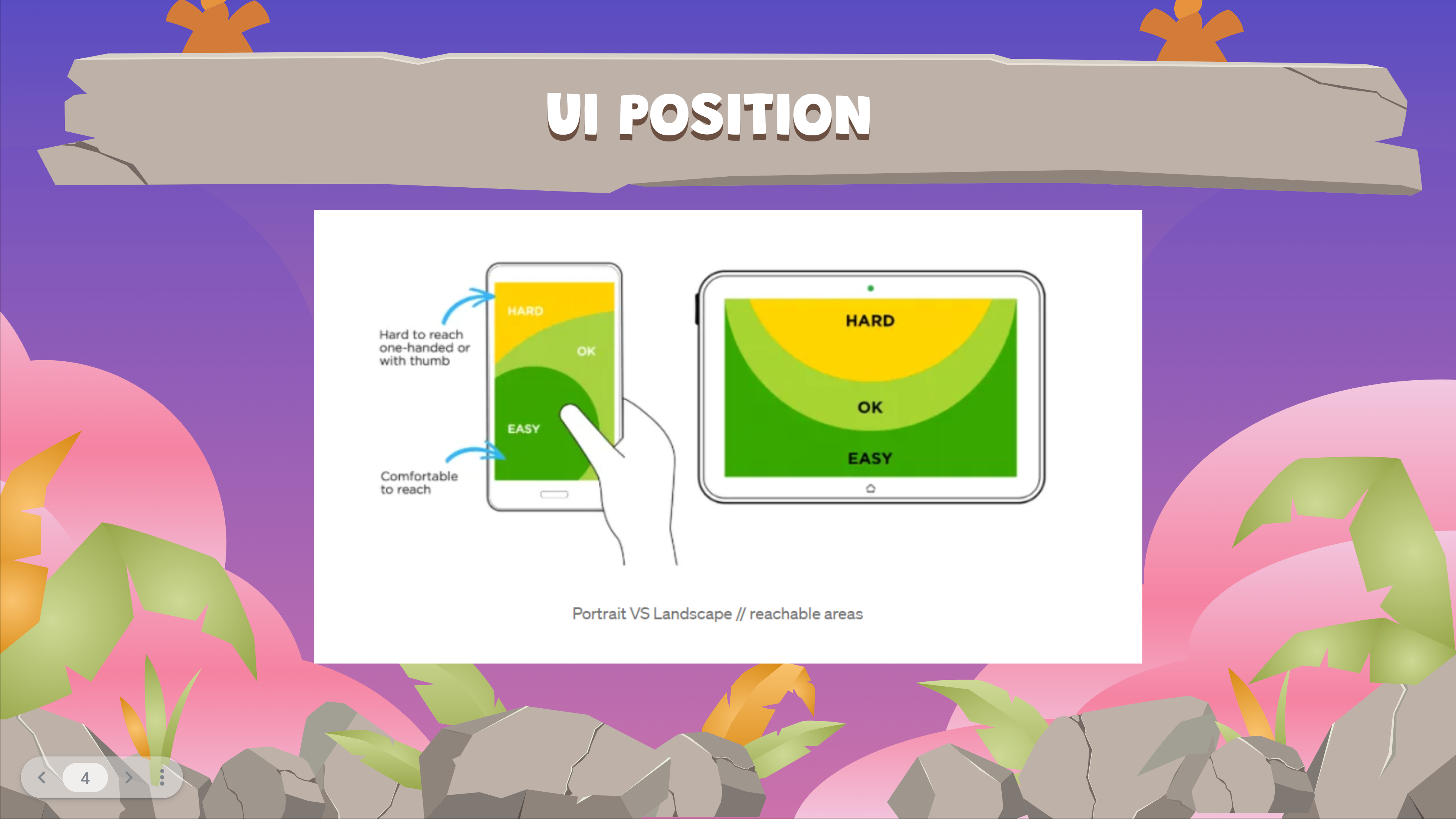
UI Positioning
Statistics show that most people are right-handed. This is important information when it comes to the UI position. Phones and tablets usually have specific comfort-to-reach and hard-to-reach areas with respect to the orientation of the device.

As indicated above we have these three areas, hard areas, the areas that are okay and the areas that are fairly easy to reach. The portrait and the landscape orientations of a phone and a tablet affect where these three areas will be. In the landscape orientation, the user gets to use both hands.
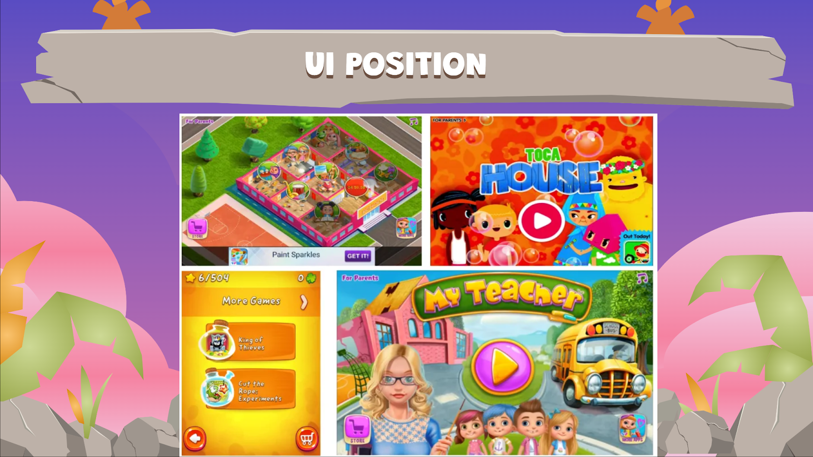
In the most comfortable to-reach area which is basically at the bottom of the screen. The practice is to place interactive elements, which can lead to monetization. Therefore, the store button, the more apps button and the ads button are usually placed at the bottom area of the screen. Users are likely to interact with these elements, unfortunately, even by mistake. Those mistakes are what we call dark UX.
Dark UX involves intentionally placing some items or designing some UI that nudges the player to make some decisions. The player might not want to make those decisions so they need some convincing to take actions that will be beneficial for their experience in the game. Dark UX has been proven to maximise revenues.
Sliders
The screen’s real estate on mobile phones is limited and content in games is just getting bigger and bigger. Sliders have therefore become a very handy component to expose many options to users regarding extra content without needing to navigate to another screen. This way a player doesn’t have to go through numerous loading screens to get to a certain area.

To help users understand that there’s more content inside, sliders usually expand outside the screen view. The best practices of sliders are as follows:
- Partly visible items: We need to make sure that whatever expands outside the screen border is still partially visible on the screen. That way the user is aware that there are some extra items.
- Animating the slider from the end to the start upon launch: When introducing sliders to users either by an automatic event or by a user-initiated event, we need to make sure to land it on the end of the content and then let it automatically scroll to the beginning. This will give the player the understanding that okay these are the possibilities, but this is where you’re going to start. If your slider contains a lot of content like 10 steps to scroll from the end to the beginning and probably the player has to swipe 10 times before they get there this helps get the player there automatically through animation.
Pro tip: If the game contains in-app purchases as part of the slider content then we need to make sure that they are partly visible with a call to action to elicit a purchase.

Pop-ups
Pop-ups are a good component for delivering abstract informational messages to the players. Some best practices for pop-ups include:
- Associating visible UI and hidden UI via animations. When pop-ups are open due to user-initiated actions, and interactive items, we need to animate their launch from the triggering button. A trick here is if you have your UI placed on your screen, the shop window should scale, from the shop button all the way to cover whatever area of the screen that you’ve designed for it to cover.
- Having a semi-transparent dimmed background behind your pop-ups. Pop-ups often require user action; they therefore can be big in size on the screen. We should help the users understand that their session is paused but still reachable. Pop-ups can be placed on top of a dimmed background that allows the users to see a bit of their dimmed previous session. The window should not cover the whole screen. The relevant information can be somewhere in the middle to allow the user to see what is behind the pop-up even though they can’t interact with it at that point.

- An X button to close. The X button is a go-to for most users when they want to avoid certain content and they tend to close the pop-up within a matter of seconds. If a pop-up contains valuable content that users need to see, you want to increase the probability that they will access that content. To do so, make sure that the close button is designed like one of the other user choices. It’s also advisable to avoid duplication. Let’s say you are giving the players some information, you should not use buttons that perform the same action such as done once the reader finishes reading the information and X for exit both of which will close the screen.

User Choices
Lots of pop-ups require user action as they offer the user an opportunity to make a decision. A rule of thumb is to place all user decisions which are good for your game on the right-hand side of the pop-up. As a game designer, you want your players to confirm a purchase, share the game or spend in-game currency. This is all based on the screen comfort areas discussed under UI positioning. Secondly, user decisions which are bad for your game are placed on the left hand side of the pop-up. As a designer, you don’t want your players to quit the game, disconnect or reset their progress.

Although this may be construed as a method of dark UX, it can actually help the users. For instance, you don’t want your user to accidentally reset their progress. The key is to lead the players to make decisions that are good for them as well as for the games’ key performance indicators such as retention and engagement.

Another tip for this section is the need to associate button colour with its function. Red symbolises a negative action and green symbolises a positive one. Blue can be used as a neutral colour.
Rewarded videos
Rewarded video ads have become an industry standard over the past years under the freemium model in mobile games. Users get rewarded in one way or the other for watching the ads. They result in a win-win situation and are better at boosting revenue and engagement as compared to interstitial ads. With interstitial ads, the win situation is lop-sided and the game developer is the only one that stands to benefit.
The following are the best practices for rewarding users after watching the video ads:
Think carefully about what the price is going to be and how you will reward it and for how long. The following are some scenarios of how the player can be rewarded:

The first scenario is permanent, once the players watch the video they receive a prize for an unlimited time.For example, they get an item which is added to their inventory and that stays there for good.
The second scenario is the player session where the player receives a prize and it is available to be used at any time during their current session. Once they quit and come back at a later time, the prize disappears. This nudges the player to play the game for a longer period of time in return increasing their session time.
Another option is rewards per scene. Here, the player watches the ad and receives a prize which can only be used at their current level. This could be in the form of a booster or other in-game advantage . After using up an extra life, for example, players will not be able to access one on the next level.
The rewarded video prizes should be significant and not little things. Otherwise, users will not want to waste their time watching the ad. As a game designer, you should think about what your users will actually need from your game before using them as rewarded ads.
Pro tip: Don’t tell the users the rewards they will get. To make the rewards exciting you need to be able to motivate their curiosity and surprise them to increase the probability that they will watch the video ad. You don’t have to tell them how many coins they will earn, let them watch the ad and then let them discover how much they earned later.
Intro videos
Game developers and designers invest a lot of time in creating an introduction video for their games. They go through reviewing storyboards and creating art, animations, sound effects and music to enhance the video. It can be very frustrating if the player simply clicks the escape button when they get to the intro video meaning all that work went down the drain for that particular player. This doesn’t mean you should not allow the user to skip. You should allow skipping but try to incorporate it into your content more seamlessly.
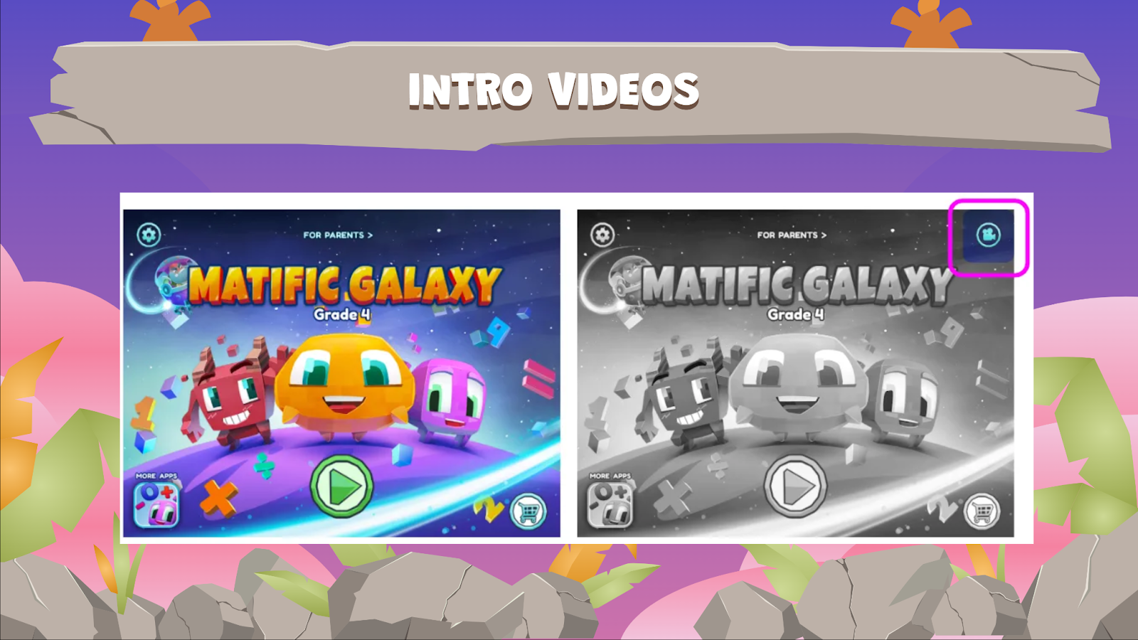
Intro videos should not be longer than 20 seconds and after the intro video is watched once, there should be a way that the player can access the video again. You can include it on the cover page or the settings menu but not on every game launch after the very first one.
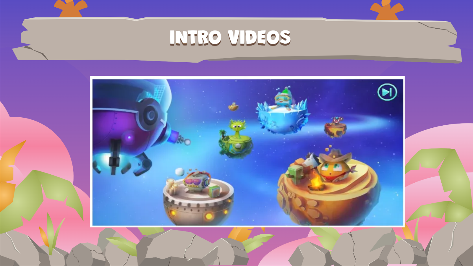
The image above demonstrates how an intro video could look at its very first launch. The game automatically takes the player to the intro video while still giving them the option to skip as indicated in the top-right corner.
You can have an invisible skip button on an intro video to prevent the escalation of a player’s impatience. The best practice is to let the skip button appear upon a player’s action. For example, the video starts and there is no skip button and the player wants to check because they are getting impatient. When the player taps the screen you can make the escape button appear. If after 2-3 seconds the player does not hit the skip button then you can make it disappear again. This allows the player to understand that the power is in their hands they can skip at any time they want.
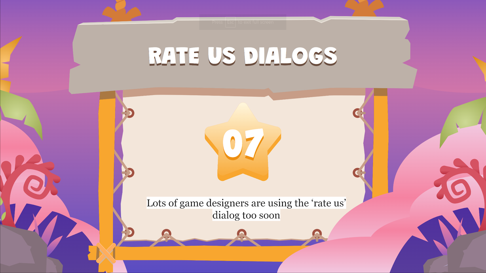
‘Rate Us’ dialogs
Many game designers use the ‘Rate Us’ dialog too soon when they call players to rate their experience in the game before they have actually formed an opinion of the game. When done right, the ’Rate Us’ dialog helps game developers achieve better ratings on the store as well as get organic reach.

After a big achievement, for example, a player has played your game and finished defeating a Level 1 boss or they’ve won a major challenge. First of all, what you’ve established here is the fact that the player is invested in the game. They have taken the time to finish a level or finish a particular section of the game.
Since they have completed that particular section and have been rewarded then it can be deduced that they are happy, relaxed and satisfied. This is a great time to show them the ‘Rate Us’ dialog. The chances of you getting a good rating at this point are high.
To maximise the probability of the users rating your game here are some tips and tricks:
- The ‘Rate Us’ dialog should include a relevant presenter. In the case of the Subway Surfers example above there’s a high chance that the player has already interacted with this character in the game. They are therefore a familiar face and a character that the player may already be invested in. The character should look directly at the player with an expression that will trigger a positive reaction from the player. In this case, the Subway Surfer character looks like they have cute convincing puppy eyes.
- The ‘Rate Us’ button should be more noticeable and it should also have a positive colour like green. It should also follow the best practices we learnt under user choices. The position of the choice you want the player to make is important and should always be on the right-hand side.

Store dialogs
The design of your store dialog is critical to your selling of items in the store. Many times the store dialog will offer a full version of the game. For instance, maybe the game you are playing is actually a demo version but if you want to purchase the full version after playing the demo you can enter the store and purchase the full version.
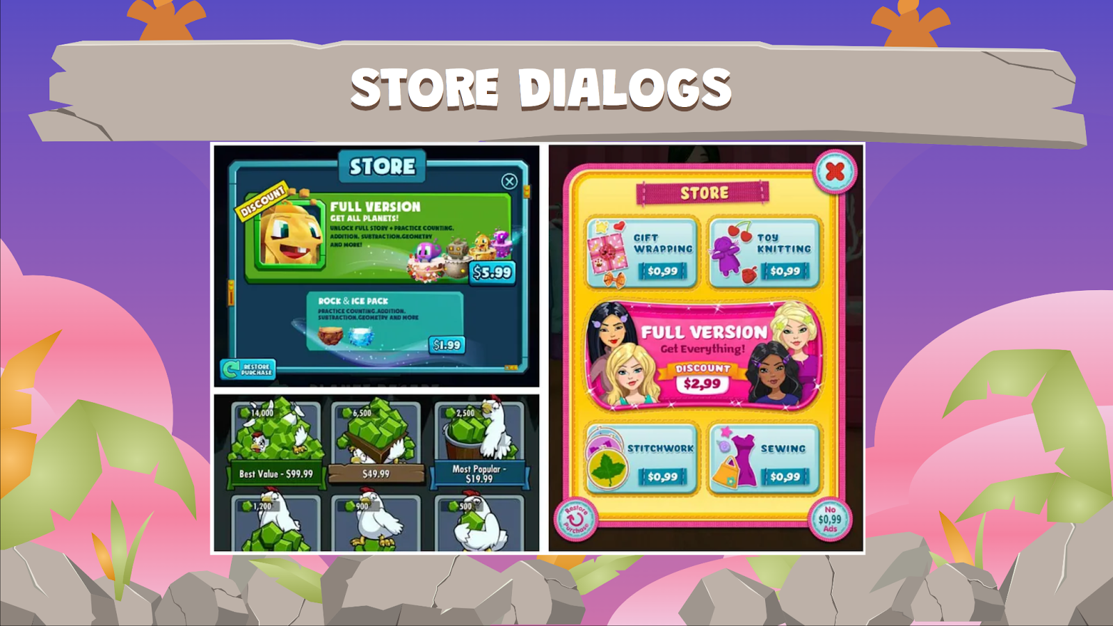
To maximise purchases of the full version you can follow these guidelines:
- Make sure that the full version dialog includes a presenter for the game. Players should have something they can relate to. Sharing the free demo allowed the player to familiarise themselves with this character.
- Make the full version button stronger in terms of colour and size. It should look more attractive than the other in-app offerings.
- Add a brief animation in terms of scaling up and down for that part to draw the player to more details that have the potential to give the developers the highest monetary return.
- The title of the full version should be bigger to give the player a clear understanding of what they are buying. So that they don’t have to struggle to figure out what this offer is about. If there are any discounts they should be boldly placed on the dialog.
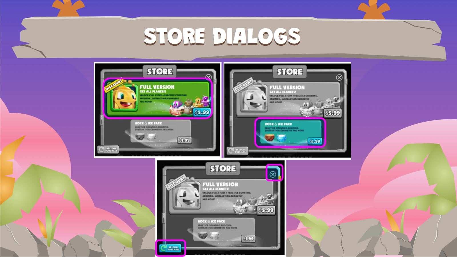
- To increase the probability of selling you can follow this animation sequence for a store dialog:
a) When the dialog opens up the full version button will first appear. You have to make sure that there are no buttons at this stage.
b) Wait for a second then bring in all the other in-app options that can be purchased at the store
c) Then, bring in all the other relevant actions that can be taken. Such as closing or refreshing the store.
Pro tip: If you are selling content such as extra levels, you can allow the user to enter a locked content screen as a way to tease what they stand to experience. And only then will you open the store dialog and dim out the background. This is better than automatically opening the store dialog and telling the player to purchase that level.
Note: It is emphasised that these best practices are not hard-and-fast rules. They are simply a good way to start and adopting them will result in a set of data ad insights that will enable better decision-making in future.